
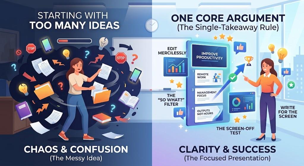
Most bad presentations don't start with bad ideas. They start with too many of them.
You research a topic, save a dozen sources, collect statistics, and fill pages with notes only to open a blank slide deck and discover that suddenly, everything looks important.
You know what happens next. The introduction bloats. The middle turns into a wall of bullet points. The ending gets rushed into the last two minutes while you race the clock.
The fix isn't a better template or a flashier color scheme. It's better judgment about what belongs, what doesn't, and the order in which someone actually needs to hear it. Here's how to get there.
Find Your One Sentence (Before You Touch a Single Slide)
Before you open your slide software, work out the actual point of your talk. You can know a topic inside and out without having a clear argument that's usually why the deck feels overstuffed.
Try compressing the whole presentation into one sentence. Not a title, not a topic the specific thing you want people to remember when they walk out.
Topic: Remote work and employee productivity. Argument: Remote work boosts productivity, but only when managers evaluate output instead of hours logged.
That sentence becomes your filter. From here on, every stat, quote, and background point has to answer one question: does this move the argument forward, or is it just interesting? Interesting isn't enough. Interesting is how decks get bloated. Relevant is how they get remembered.
Organize for Understanding, Not for Discovery
Research is naturally messy. One article leads to a study, the study raises a stat, the stat sends you down a rabbit hole you didn't plan for. That's completely normal and exactly why your notes should never dictate your slide order.
Your audience didn't take that research journey with you. They don't need the scenic route; they need the shortest path to understanding.
| Research mindset (avoid) | Storytelling mindset (use) |
|---|---|
| Slides in the order you found things | Slides in the order that builds an argument |
| Focused on how much you found | Focused on what actually matters |
| Raw data dumped onto the screen | Data interpreted before it's shown |
If the honest reason Slide 4 follows Slide 3 is "because that's what came next in my notes," the structure needs another look.
Give Every Slide One Job Just One
A slide trying to introduce a problem, show data, and pitch a solution all at once usually does none of those things well. Give each slide a single, clear job: introduce an idea, present evidence, compare two things, or draw out an implication.
That changes your headings too. "Research Findings" tells your audience nothing. "82% of Remote Workers Report Lower Burnout" tells them exactly what to expect and gives a skimming reader (or a skimming search engine) something concrete to grab.
Don't let a statistic ride for free just because it has a source attached, either. Ask what it actually proves, what it leaves out, and why it's sitting on this slide and not another. For students and professionals working from a detailed brief, this is the same editorial question a presentation writing service UK deals with on every project what stays, what goes, and what belongs where.
Write for the Screen, Not the Page
Reading and listening compete for the same attention, and on a slide, listening usually loses. If your audience is reading six lines of text while you're talking over them, they're doing neither task well and remembering even less.
That doesn't mean every slide needs three words and a stock photo. Some subjects genuinely need detail. The skill is deciding what needs to be seen versus what can simply be said.
A simple process:
- Write the full explanation in your speaker notes first.
- Strip the slide down to the number, comparison, or single line the audience actually needs to remember.
- Keep the font size honest. If you have to shrink it to fit everything, the problem isn't the font it's that there's too much on the page.
Open With a Problem, Not a Definition
Most decks open the same forgettable way: a broad definition nobody asked for.
Weak: "Communication is a key part of every organization." Strong: "A message can reach 500 people in three seconds and still leave every one of them unsure what to do next."
The second version creates a small, itchy problem the audience wants resolved. That tension is your hook, and it's doing real work before you've shared a single fact. Then, and this is the part people skip, make sure your closing slide comes back and answers the question you opened with. That callback is what makes a talk feel finished instead of just stopped.
The "So What?" Habit
The gap between an average presentation and a genuinely persuasive one usually comes down to one habit: asking "so what?" after every major claim.
Fact: Onboarding takes 14 days. So what? Because it takes 14 days, 30% of new users drop off before setup is complete costing roughly $12,000 a month.
Audiences rarely remember raw numbers. They remember what those numbers cost, changed, or made possible. If a stat can't survive a "so what," it probably doesn't belong on the slide.
The Screen-Off Test
Before you spend an hour adjusting colors and icons, run a quick check. Step away from the laptop and explain the entire presentation out loud, from memory, in under two minutes no slides, no notes.
You'll immediately hear what the visuals were quietly hiding: a finding introduced before its question, a slide leaning on something explained three sections earlier, a whole section that sounds smart but adds nothing to the actual argument.
Then read only your slide titles, top to bottom, nothing else. On their own, they should read like a rough outline of your argument. If one could disappear and nothing would be lost, that's your answer cut it.
Leave Them With One Clear Thing
The strongest presentations aren't the ones packed with the most research. They're the ones where the audience always knows what matters and why.
That comes from deciding early: find your one sentence, build the evidence around it, give every slide a single job, and let go of everything that's interesting but unnecessary. Keep the leftover data, backup charts, and extra arguments in your notes or an appendix they're proof you did the work, not proof they need to see it.
A presentation isn't a record of everything you know. It's a path someone else can follow without having to do the thinking themselves.